


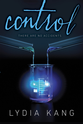
First I want to start with the color scheme. Purple and blue always work together. And the fact that they're illuminated with the light is making it even better. Then I love the fact that its so simple but gives a little insight into the title. The font for the title is cool too. I like the way its scripted and not just simply written across the front.
So what do you think about this series?
-Nikki H.
Ooh, it's so bright. And I completely agree with you, purple and blue were made for each other. :)
ReplyDeleteNice pick. Love the strange eerie feeling it gives off.
Hello, Cheyenne!
ReplyDeleteI just want to inform you that I nominated you for the REALITY Blog Award. I hope you don't mind. Feel free to check it out at http://bookmavenpicks.wordpress.com/2013/02/09/book-mavens-picks-receives-the-reality-blog-award/
Continue writing awesome posts! Take care.
Best,
Jhobell Kristyl
http://bookmavenpicks.wordpress.com/
I LOVE this one... presumably because I'm biased toward the obvious subject matter.
ReplyDeleteI also love your blog and have nominated you for the Liebster Blog Award, an award for new blogs with fewer than 200 followers. Looks like I can JUST get it in under the wire before you cross that mark...
Please check it out here:
http://www.kristenelisephd.blogspot.com/2013/02/the-leibster-blog-award-bit-of-comic.html