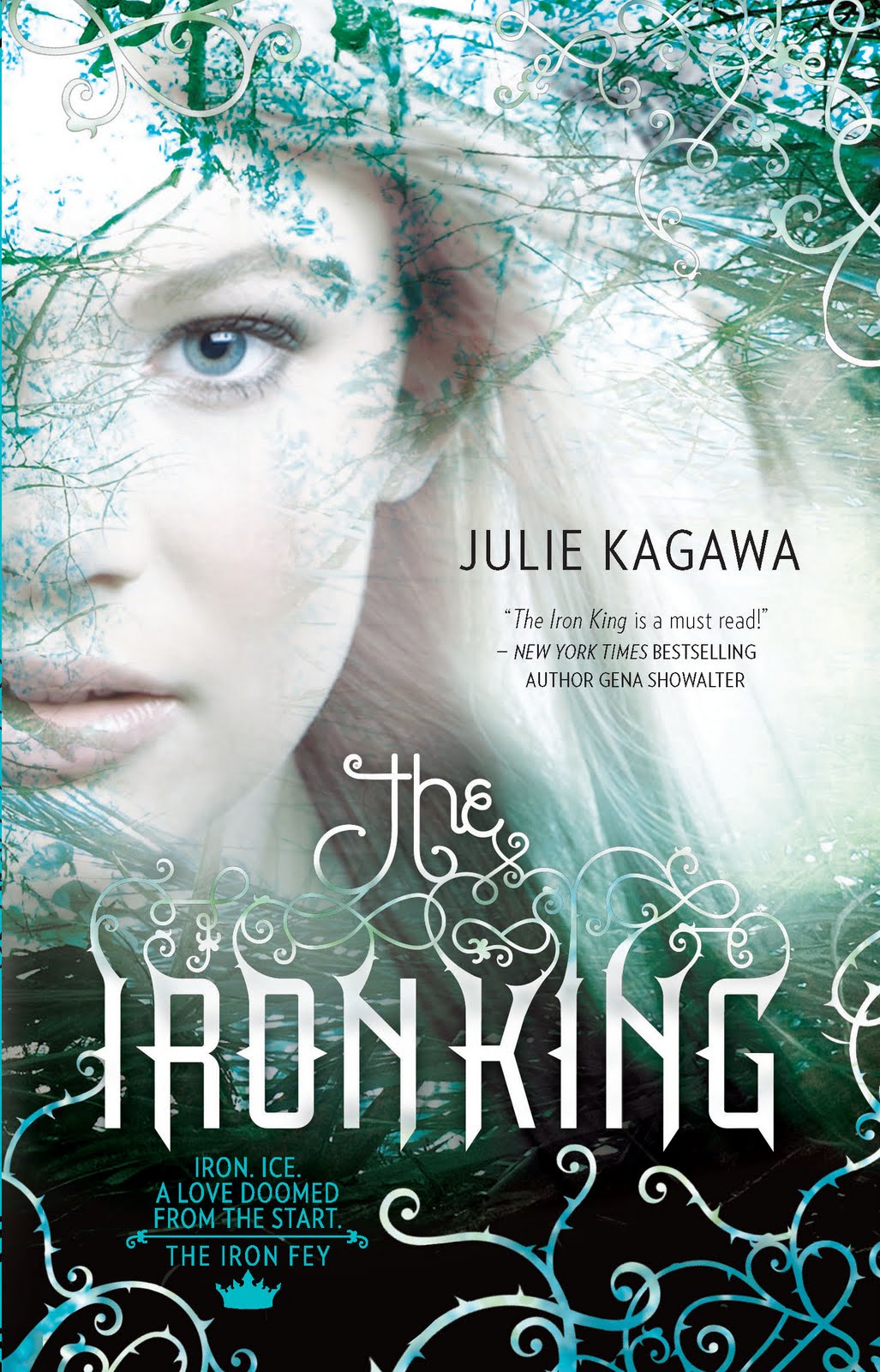
The Iron King by Julie Kagawa
This is a fairly popular book, so you've probably seen it around before. It's got a lot of techniques I really like going on. The first is the focus on the eye. The coloring is just right to make that blue pop, especially with the pale-colored skin.
Something I think a lot of people probably appreciate is partially shrouded face. It lets you see part of the girl, but that's not the only thing to look at on the cover. Now, my favorite part, personally, is that font. Look at the uniqueness! Look at the scroll work! Look how it ties into the cover! It's all just lovely.
Your thoughts?


This book is on my wish list, I love the cover and the blurb, it really looks like a must read!
ReplyDeleteI think so too! I haven't read it yet, but I hope it's as good as it looks. (:
Delete