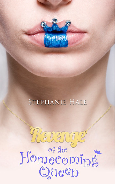

It kind of astounds me how different a picture can look. Actually, if it wasn't for the uniqueness of this particular picture, I might not have noticed. But after our own Megan featured one cover, I spotted the other and recognized the familiar blue crown, as different as these two happen to be.
What does everybody think? Which cover used the picture better?


Hmm...having trouble with the comments. I meant to say, I don't like this particular cover - either of them, but Kings & Queens uses the picture better. Keep covering the covers! Love this blog.
ReplyDeleteHaha, we'll covering covers as long as they are lovely covers there for us to drool over. ;) Thanks for the feedback! (:
Delete