


 US vs. UK
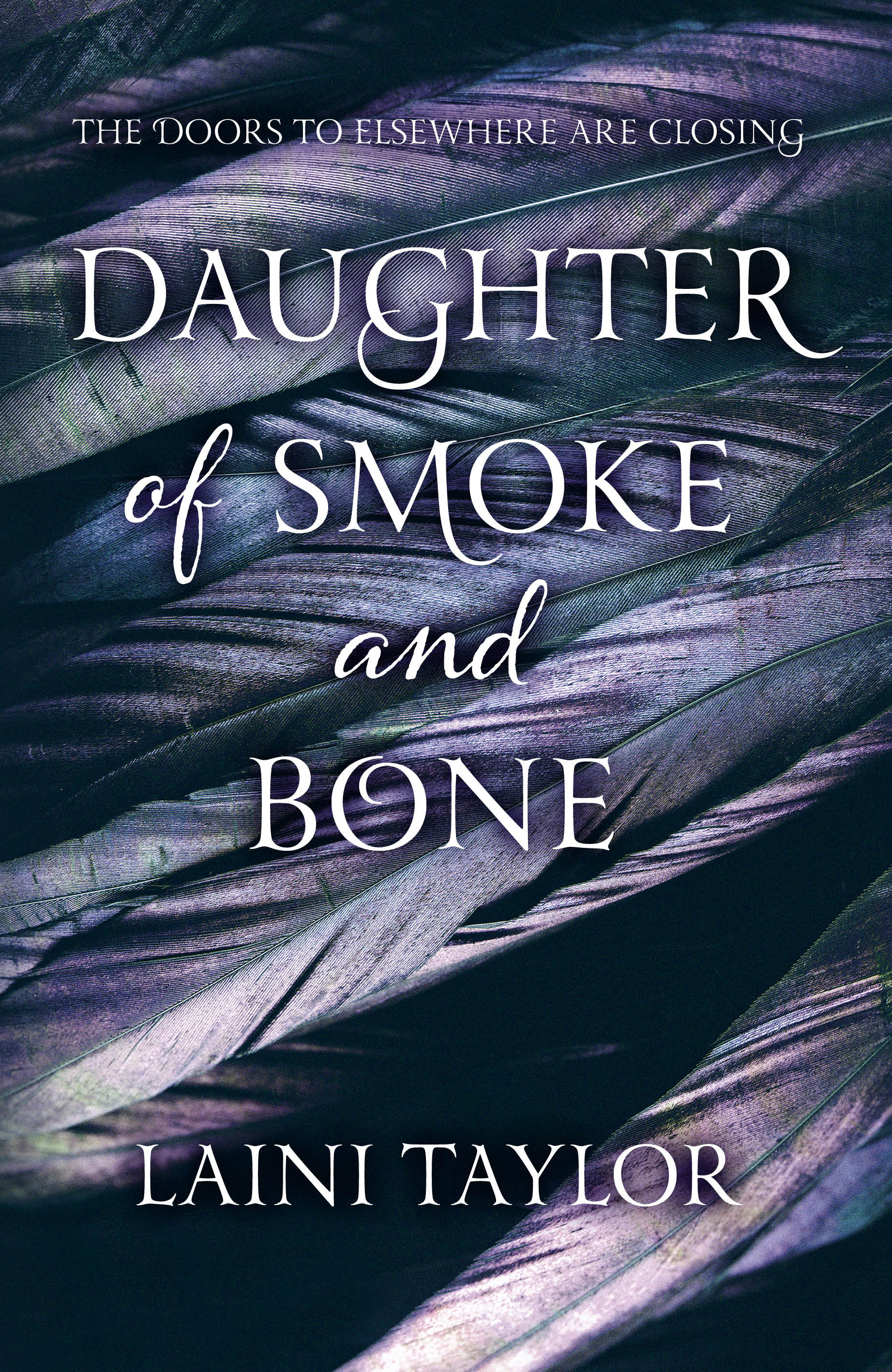
So this is my very first cover battle, and, from many years of playing Mario Kart, I know that people can get pretty competitive in versus mode. However, as we have two great contenders up to bat, I think we can sidestep most of the smack talk and just talk about the highlights. (I really don't know why I'm using so many sport terms today...bear with me, people.)
Alright, so both covers came through on fonts: the two that the US picked work great together, and I love how the UK cover has the "and" and the "of" styled differently than the rest, although I wish they'd have switched up the font for the author's name. Best feature of the US cover? That gorgeous mask. On the flip-side, the purple-tinted feathers work great on the UK cover.
In my opinion, our champion is the US cover. My love of masquerade masks is just too great for this competition to have ended any other way.
Your thoughts?
I would have to go with the UK on this one. The image and coloring of the feathers combined with that beautiful typestyle won me over. I like the type used for Smoke & Bone the US version but nothing else.
ReplyDeleteIt was hard for me to choose between them. Thanks for letting me know what you thought! (:
DeleteI agree. The UK cover is nice, but I don't think I'd ever pick up the book based on the cover. US definitely wins. New Follower! Glad I found you!
ReplyDeleteSarah
Thanks for following! I'm following your blog now. (:
Delete